

一. 概述
本文將介紹一套非常好用的一個免費資源,由 Google 所提供的 Colab 這項雲端服務。
延續上一章節的理念,此系列的目的為工具書導向,這裡將持續介紹一些實用繪圖的技巧應用,其應用除了 Python 常用 matplotlib 資料庫之外,還導入 Altair、Plotly、Bokeh 等資料庫來實現更多元的圖表應用。而還能利用強大的 Altair 資料庫來達成互動式的圖表製作 !! 如下圖文章架構圖所示,此架構圖隸屬於 i.MX8M Plus 的方案博文中,並屬於 Third Party 軟體資源的 Google Colab 密技大公開 之部分,目前章節介紹 “Colab 應用技巧(下)”。
若新讀者欲理解更多人工智慧、機器學習以及深度學習的資訊,可點選查閱下方博文
大大通精彩博文 【ATU Book-i.MX8系列】博文索引

Colab 系列博文-文章架構示意圖
二. Google Colab 應用技巧
1. 繪製圖表 :
Colab 提供常用的 Matplotlib 套件來展示圖表數據。
下列附上 程式儲存格的代碼(灰底) 以及 運行結果(灰底後的圖示),複製貼上至 Colab 即可使用 !!
(1) 折線圖
 import matplotlib.pyplot as plt
x  = [1, 2, 3, 4, 5, 6, 7, 8, 9]
y1 = [1, 3, 5, 3, 1, 3, 5, 3, 1]
y2 = [2, 4, 6, 4, 2, 4, 6, 4, 2]
plt.plot(x, y1, label="line L")
plt.plot(x, y2, label="line H")
plt.plot()
plt.xlabel("x axis")
plt.ylabel("y axis")
plt.title("Line Graph Example")
plt.legend()
plt.show()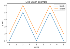
(2) 長條圖
import matplotlib.pyplot as plt
# Look at index 4 and 6, which demonstrate overlapping cases.
x1 = [1, 3, 4, 5, 6, 7, 9]
y1 = [4, 7, 2, 4, 7, 8, 3]
x2 = [2, 4, 6, 8, 10]
y2 = [5, 6, 2, 6, 2]

# Colors: https://matplotlib.org/api/colors_api.html
plt.bar(x1, y1, label="Blue Bar", color='b')
plt.bar(x2, y2, label="Green Bar", color='g')
plt.plot()
plt.xlabel("bar number")
plt.ylabel("bar height")
plt.title("Bar Chart Example")
plt.legend() 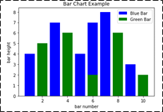
(3) 直方圖
mport matplotlib.pyplot as plt
import numpy as np
# Use numpy to generate a bunch of random data in a bell curve around 5.
n = 5 + np.random.randn(1000)
m = [m for m in range(len(n))]
# Histogram
plt.hist(n, bins=20)
plt.title("Histogram")
plt.show()
plt.hist(n, cumulative=True, bins=20)
plt.title("Cumulative Histogram")
plt.show() 
(4) 散點圖
import matplotlib.pyplot as plt
x1 = [2, 3, 4]
y1 = [5, 5, 5]
x2 = [1, 2, 3, 4, 5]
y2 = [2, 3, 2, 3, 4]
y3 = [6, 8, 7, 8, 7]
# Markers: https://matplotlib.org/api/markers_api.html
plt.scatter(x1, y1)
plt.scatter(x2, y2, marker='v', color='r')
plt.scatter(x2, y3, marker='^', color='m')
plt.title('Scatter Plot Example')
plt.show() 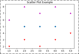
(5) 堆疊折線圖
import matplotlib.pyplot as plt
idxes = [ 1,  2,  3,  4,  5,  6,  7,  8,  9]
arr1  = [23, 40, 28, 43,  8, 44, 43, 18, 17]
arr2  = [17, 30, 22, 14, 17, 17, 29, 22, 30]
arr3  = [15, 31, 18, 22, 18, 19, 13, 32, 39]

# Adding legend for stack plots is tricky.
plt.plot([], [], color='r', label = 'D 1')
plt.plot([], [], color='g', label = 'D 2')
plt.plot([], [], color='b', label = 'D 3')
plt.stackplot(idxes, arr1, arr2, arr3, colors= ['r', 'g', 'b'])
plt.title('Stack Plot Example')
plt.legend()
plt.show() 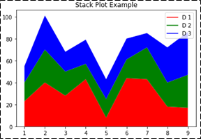
(6) 圓餅圖
import matplotlib.pyplot as plt
labels = 'S1', 'S2', 'S3'
sections = [56, 66, 24]
colors = ['c', 'g', 'y']
plt.pie(sections, labels=labels, colors=colors, startangle=90, explode = (0, 0.1, 0), autopct = '%1.2f%%')
plt.axis('equal') # Try commenting this out.
plt.title('Pie Chart Example')
plt.show() 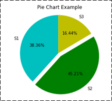
(7) 子圖表應用
import matplotlib.pyplot as plt
import numpy as np

def random_plots():
  xs = []
  ys = []
  for i in range(20):
    x = i
    y = np.random.randint(10)
    xs.append(x)
    ys.append(y)
  return xs, ys

fig = plt.figure()
ax1 = plt.subplot2grid((5, 2), (0, 0), rowspan=1, colspan=2)
ax2 = plt.subplot2grid((5, 2), (1, 0), rowspan=3, colspan=2)
ax3 = plt.subplot2grid((5, 2), (4, 0), rowspan=1, colspan=1)
ax4 = plt.subplot2grid((5, 2), (4, 1), rowspan=1, colspan=1)

x, y = random_plots()
ax1.plot(x, y)

x, y = random_plots()
ax2.plot(x, y)

x, y = random_plots()
ax3.plot(x, y)

x, y = random_plots()
ax4.plot(x, y)

plt.tight_layout()
plt.show()) 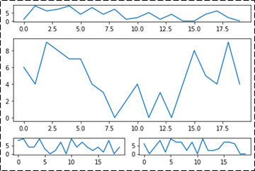
(8) 3D 散點圖
import matplotlib.pyplot as plt
import numpy as np
from mpl_toolkits.mplot3d import axes3d
fig = plt.figure()
ax = fig.add_subplot(111, projection = '3d')
x1 = [1, 2, 3, 4, 5, 6, 7, 8, 9, 10]
y1 = np.random.randint(10, size=10)
z1 = np.random.randint(10, size=10)
x2 = [-1, -2, -3, -4, -5, -6, -7, -8, -9, -10]
y2 = np.random.randint(-10, 0, size=10)
z2 = np.random.randint(10, size=10)
ax.scatter(x1, y1, z1, c='b', marker='o', label='blue')
ax.scatter(x2, y2, z2, c='g', marker='D', label='green')
ax.set_xlabel('x axis'), ax.set_ylabel('y axis'), ax.set_zlabel('z axis')
plt.title("3D Scatter Plot Example")
plt.legend(), plt.tight_layout(), plt.show() 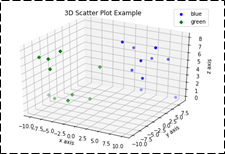
(9) 3D 直線圖
import matplotlib.pyplot as plt
import numpy as np
fig = plt.figure()
ax = fig.add_subplot(111, projection = '3d')
x = [1, 2, 3, 4, 5, 6, 7, 8, 9, 10]
y = np.random.randint(10, size=10)
z = np.zeros(10)
dx = np.ones(10)
dy = np.ones(10)
dz = [1, 2, 3, 4, 5, 6, 7, 8, 9, 10]
ax.bar3d(x, y, z, dx, dy, dz, color='g')
ax.set_xlabel('x axis'), ax.set_ylabel('y axis'), ax.set_zlabel('z axis')
plt.title("3D Bar Chart Example")
plt.tight_layout(), plt.show() 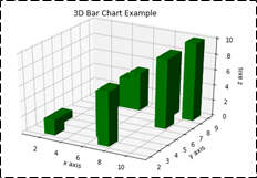
(10) 3D 線框圖
import matplotlib.pyplot as plt
fig = plt.figure()
ax = fig.add_subplot(111, projection = '3d')
x, y, z = axes3d.get_test_data()
ax.plot_wireframe(x, y, z, rstride = 2, cstride = 2)
plt.title("Wireframe Plot Example")
plt.tight_layout()
plt.show() 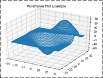
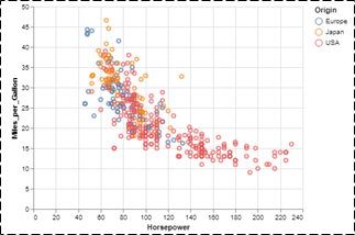
(11) 額外套件 - Altair
import altair as alt
from vega_datasets import data
cars = data.cars()
alt.Chart(cars).mark_point().encode(x='Horsepower',y='Miles_per_Gallon', color='Origin',).interactive() 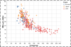
(12) 額外套件 - Plotly
from plotly.offline import iplotimport plotly.graph_objs as go
data = [go.Contour( z=[[10, 10.625, 12.5, 15.625, 20], [5.625, 6.25, 8.125, 11.25, 15.625],
[2.5, 3.125, 5., 8.125, 12.5],[0.625, 1.25, 3.125, 6.25, 10.625], [0, 0.625, 2.5, 5.625, 10]] )]
iplot(data)
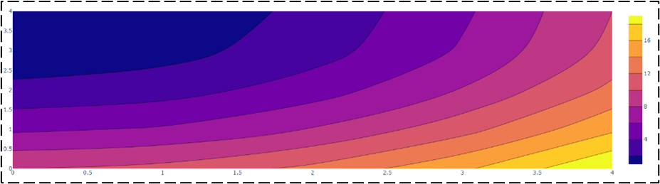
官方網站 : https://plotly.com/python/
(13) 額外套件 - Bokeh
import numpy as np
from bokeh.plotting import figure, show
from bokeh.io import output_notebook
# Call once to configure Bokeh to display plots inline in the notebook.
output_notebook()
N = 4000
x = np.random.random(size=N) * 100
y = np.random.random(size=N) * 100
radii = np.random.random(size=N) * 1.5
colors = ["#%02x%02x%02x" % (r, g, 150) for r, g in zip(np.floor(50+2*x).astype(int), np.floor(30+2*y).astype(int))]
p = figure()
p.circle(x, y, radius=radii, fill_color=colors, fill_alpha=0.6, line_color=None)
show(p) 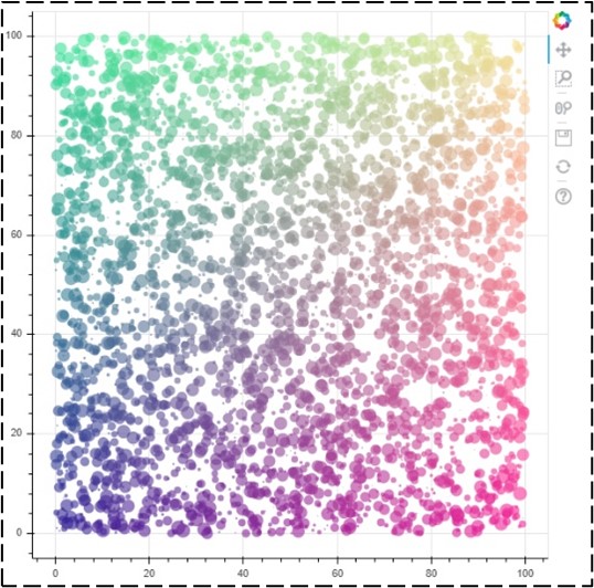
官方網站 : https://bokeh.org/
2. 互動式套件 - 表格操作 :
Colab 有額外的 pandas 互動式顯示之擴充套件,能夠動態濾除、排序、檢索等數據。
(1) Panda 數據表格展示
from google.colab import data_table
from vega_datasets import data
data_table.enable_dataframe_formatter()
data.airports() 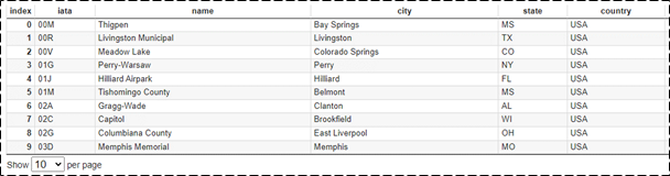
PS : 使用 “data_table.disable_dataframe_formatter()” 則會恢復成原生的 panda 顯示方式。
(2) Panda 數據表格展示 (自行設定)
from google.colab import data_table
from vega_datasets import data
data_table.DataTable(data.airports(), include_index=False, num_rows_per_page=5) 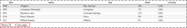
3. 互動式套件 – 圖表操作 :
Colab 亦有提供強大的互動式圖表套件 Altair,以精美的圖表呈現數據。
(1) 散點圖
# load an example dataset
from vega_datasets import data
cars = data.cars()

# plot the dataset, referencing dataframe column names
import altair as alt
alt.Chart(cars).mark_point().encode( x='Horsepower',  y='Miles_per_Gallon',  color='Origin' ).interactive()
(2) 互動式散點圖
# load an example dataset

from vega_datasets import data
cars = data.cars()

import altair as alt
points = alt.Chart(cars).mark_point().encode( x='Year:T', y='Miles_per_Gallon', color='Origin' ).properties( width=800 )
lines = alt.Chart(cars).mark_line().encode( x='Year:T', y='mean(Miles_per_Gallon)', color='Origin').properties( width=800).interactive(bind_y=False)
points + lines
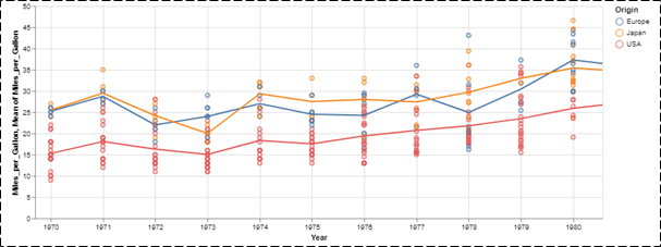
PS : 此圖可以用滑鼠滾動來縮放檢視數值範圍。
(3) 長條圖
# load an example dataset
from vega_datasets import data
cars = data.cars()

# plot the dataset, referencing dataframe column names
import altair as alt
alt.Chart(cars).mark_bar().encode( x='mean(Miles_per_Gallon)', y='Origin', color='Origin' ) 
(4) 直方圖
# load an example dataset
from vega_datasets import data
cars = data.cars()

# plot the dataset, referencing dataframe column names
import altair as alt
alt.Chart(cars).mark_bar().encode( x=alt.X('Miles_per_Gallon', bin=True), y='count()',) 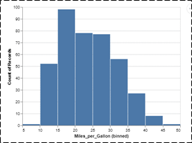
(5) 推疊直方圖
# load an example dataset
from vega_datasets import data
cars = data.cars()

# plot the dataset, referencing dataframe column names
import altair as alt
alt.Chart(cars).mark_bar().encode( x=alt.X('Miles_per_Gallon', bin=True), y='count()', color='Origin' ) 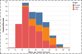
(6) 圖表應用-結合相同類型圖表
# load an example dataset
from vega_datasets import data
cars = data.cars()

# plot the dataset, referencing dataframe column names
import altair as alt
interval = alt.selection_interval()
base = alt.Chart(cars).mark_point().encode( y='Miles_per_Gallon', color=alt.condition(interval, 'Origin', alt.value('lightgray'))).properties(selection=interval)
base.encode(x='Acceleration') | base.encode(x='Horsepower') 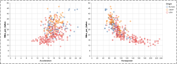
(7) 圖表應用-結合不同類型圖表
# load an example dataset
from vega_datasets import data
cars = data.cars()

# plot the dataset, referencing dataframe column names
import altair as alt
interval = alt.selection_interval()
points = alt.Chart(cars).mark_point().encode(x='Horsepower',y='Miles_per_Gallon',color=alt.condition(interval, 'Origin', alt.value('lightgray'))).properties(selection=interval)
histogram = alt.Chart(cars).mark_bar().encode(x='count()',y='Origin',color='Origin').transform_filter(interval)
points & histogram 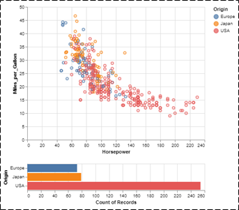
三. 結語
本文主要目的是推廣 Colab 的實用性為主,其用意是希望讀者可以將此系列博文當作一套工具書來查閱,來達到快速應用之目的。本文介紹一系列 matplotlib 繪圖方式,其中比較值得關注的是互動式圖表套件 Altair,能此套件或資料庫來實現互動式操作,透過滾動滑鼠的方式來檢視圖表 !! 相當精美 !! 後續文章,將說明在 Colab 平台上該如何配合 Google Drive 、 Google Sheet 、 GitHub 來做到更多元的應用服務,敬請期待 !!
四. 參考文件
[1] 官方文件 - Colaboratory 官網
[2] 第三方文件 -鳥哥的首頁
如有任何相關 Colab 技術問題,歡迎至博文底下留言提問 !!
接下來還會分享更多 Colab 的技術文章 !!敬請期待 【ATU Book-i.MX8 系列 - Colab 】 !!

評論